빈 페이지에서 시작되는 무한한 가능성
1WP(One White Paper)는 대구를 기반으로 활동하는 그래픽 디자인 스튜디오입니다. 디자이너 백지원의 이름에서 출발한 1WP는 한 장의 하얀 종이를 의미합니다. 우리는 아무것도 그려지지 않은 빈 페이지가 가진 무한한 가능성을 믿으며, 아직은 흐릿한 브랜드의 가능성을 1WP만의 선명한 시각적 해석으로 풀어냅니다.
Infinite possibilities, starting from a blank page.
1WP (One White Paper) is a graphic design studio based in Daegu, South Korea. Inspired by the name of its designer, Baek Jiwon, 1WP represents a single sheet of white paper. We believe in the infinite possibilities held within a blank page, transforming the still-undefined potential of each brand into a clear and distinctive visual identity through 1WP’s unique perspective.

1WP의 심볼은 브랜드 네임의 세 가지 핵심 기호인 숫자 '1', 그리고 알파벳 'W'와 'P'를 하나의 조형으로 결합한 모노그램입니다. 숫자 '1'의 시작점과 'W'의 흐름, 그리고 'P'로 이어지는 유기적인 연결 구조는 '하얀 종이 한장(One White Paper)'에서 시작하여 하나의 온전한 브랜드 경험을 설계해 나가는 창조적 과정을 시각화합니다. 불필요한 장식을 배제하고 본질적인 직선과 곡선의 조화만으로 1WP만의 강력하고 단단한 정체성을 표현합니다.
The 1WP symbol is a monogram that combines the brand name’s three defining elements—the number “1” and the letters “W” and “P”—into a single unified form. The starting point of the number “1,” the flowing structure of the “W,” and its organic transition into the “P” visualize 1WP’s creative process: beginning with a single sheet of white paper and developing it into a complete and cohesive brand experience. By eliminating unnecessary ornamentation and focusing solely on the balance of essential straight lines and curves, the symbol conveys 1WP’s bold, solid, and distinctive identity.


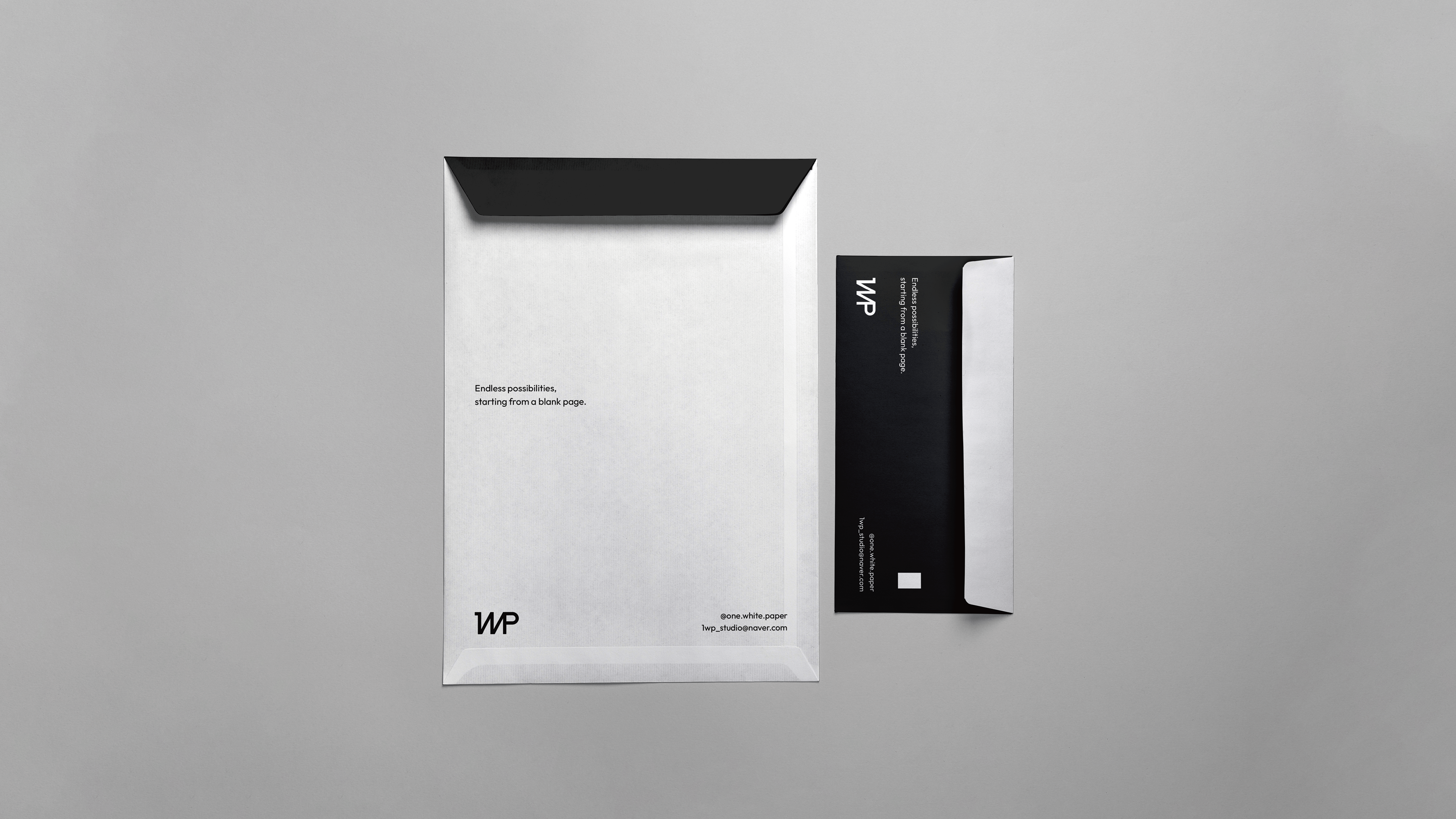
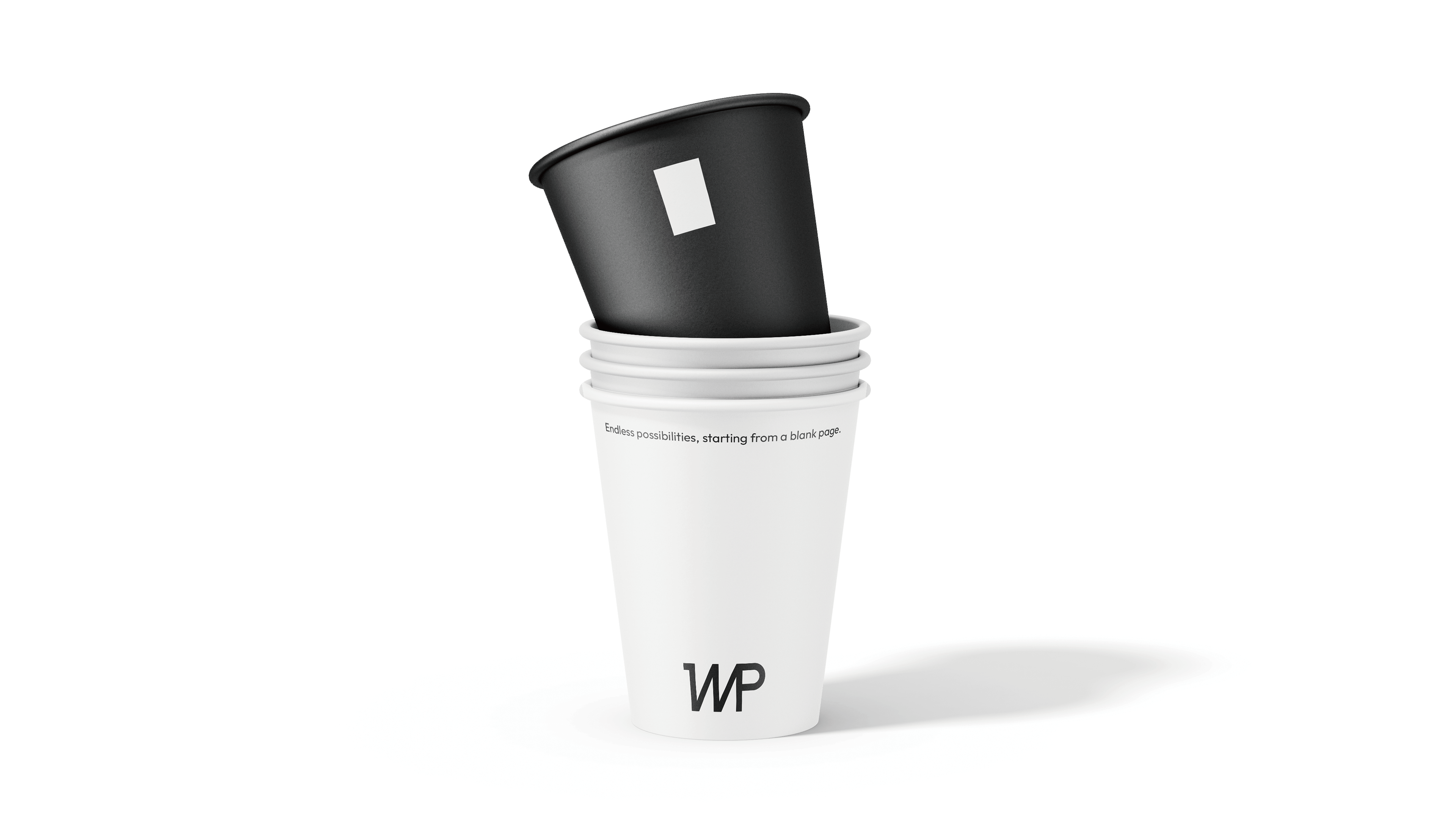
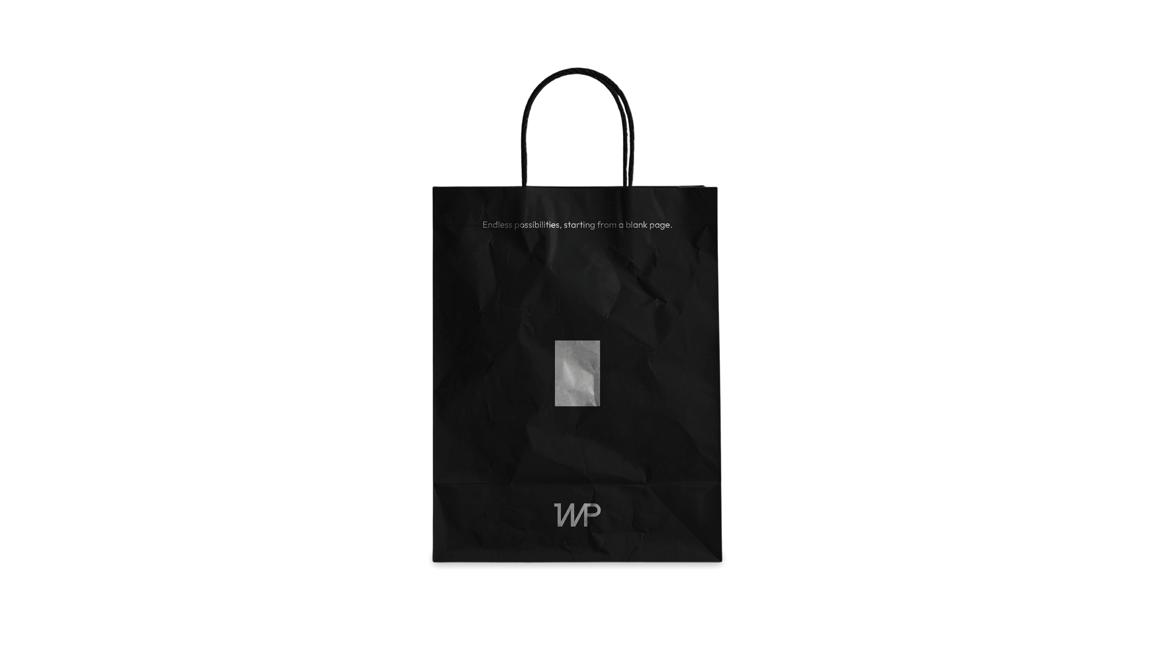
1WP의 메인 그래픽은 브랜드의 출발점이자 상징인 '하얀 종이 한장(One White Paper)'를 복잡한 장식 없이 가장 순수하고 직관적인 면의 대비로 시각화한 모티브입니다. 어두운 배경 중심에 단단하게 놓인 하얀 사각형은 아무것도 없는 백지 상태에서 출발하여 브랜드의 잠재력을 선명하게 이끌어내는 1WP의 무한한 크리에이티브를 상징합니다.
1WP’s primary graphic motif visualizes the brand’s origin and central symbol—a single sheet of white paper—through the pure and intuitive contrast of simple planes, free from unnecessary ornamentation. The solid white square positioned at the center of a dark background represents 1WP’s limitless creativity: beginning with a completely blank page and bringing each brand’s latent potential into clear visual focus.


고딕 계열의 정수이자 디지털 환경에서 최고의 가독성을 자랑하는 프리텐다드는 획의 굵기와 비례가 매우 일관되어 시각적 노이즈를 최소화하며 정보 전달에만 집중합니다. 단정하고 묵직한 구조는 1WP가 제안하는 솔루션에 안정감을 부여하며, 단단하고 굳건한 전문가로서의 신뢰감을 상대방에게 가장 완벽한 형태로 전달합니다.
Outfit 서체는 기하학적이고 단단한 산세리프(Gothic) 특유의 이성적이고 프로페셔널한 구조를 지닙니다. 동시에 자형 구석구석에 부드럽고 둥근 곡선적 디테일이 가미되어 있어, 자칫 딱딱하게만 느껴질 수 있는 브랜드 전반에 지루하지 않은 환기 역할을 수행합니다.
Pretendard represents the essence of the sans-serif typeface and offers exceptional legibility across digital environments. Its highly consistent stroke weight and proportions minimize visual noise, allowing the content to remain clear and focused. Its clean yet substantial structure reinforces the stability of the solutions proposed by 1WP, conveying the brand’s reliability as a strong, steadfast, and highly professional partner.
The Outfit typeface features the rational and professional structure characteristic of a geometric, solid sans-serif. At the same time, subtle soft and rounded details are incorporated throughout its letterforms, providing a refreshing visual contrast that keeps the overall brand identity from feeling overly rigid or monotonous.