(지극히 주관적인) 새벽두부 리브랜딩 프로젝트
평소 자주 주문해 먹는 카페인 만큼 애정을 담아, 아쉬웠던 디자인을 새로운 시각으로 풀어본 개인 리브랜딩 프로젝트입니다.
기존 새벽두부는 조합형 로고와 두부 캐릭터가 서로 다른 이미지를 형성해 일관된 브랜드 인상을 전달하기 어려워 보였습니다. 또한 두부의 이미지를 직접적으로 보여주는 데 집중되어, 두유와 디저트를 함께 즐기는 카페로서의 정체성과 확장성이 충분히 드러나지 않는다고 판단했습니다.
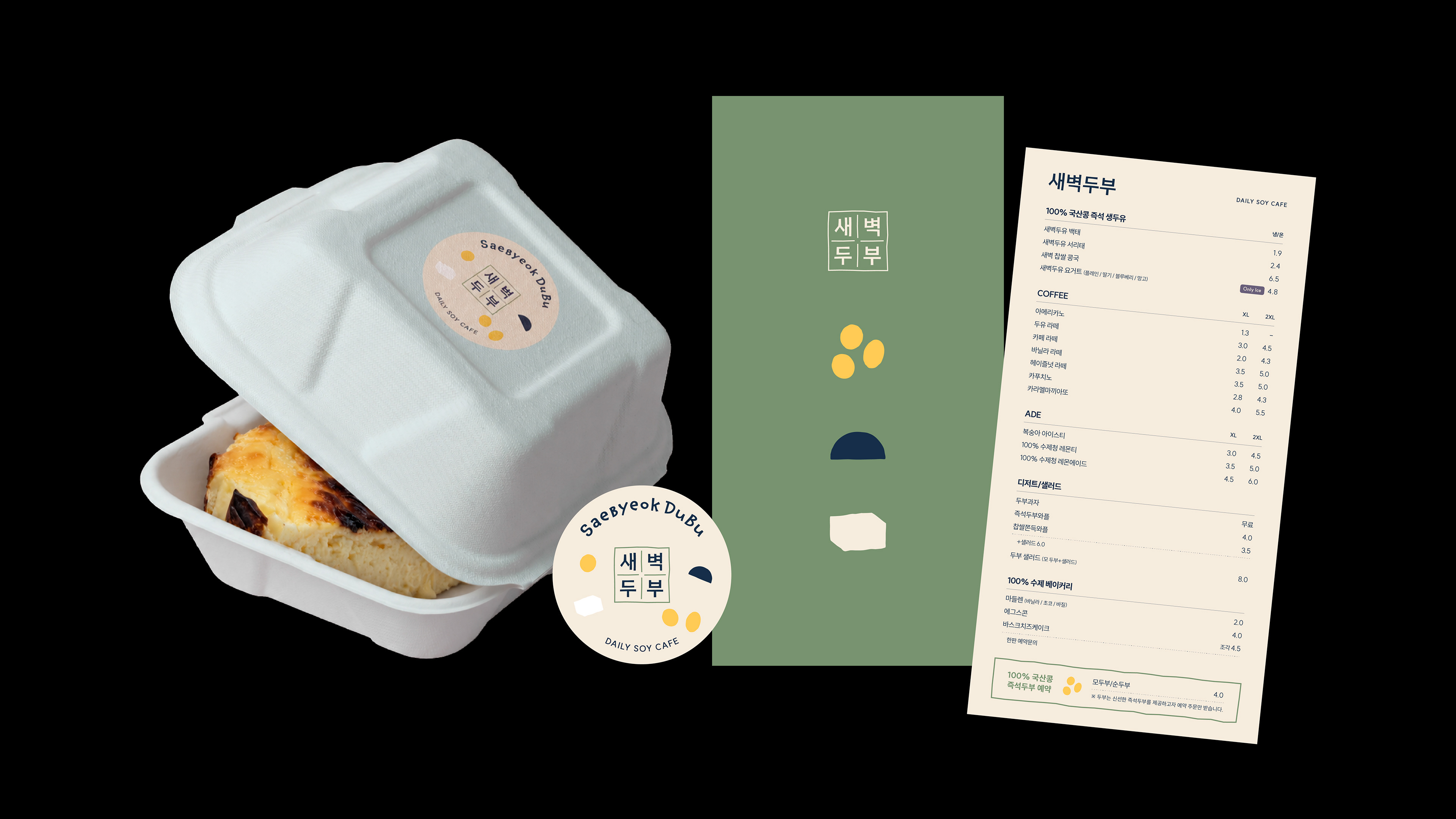
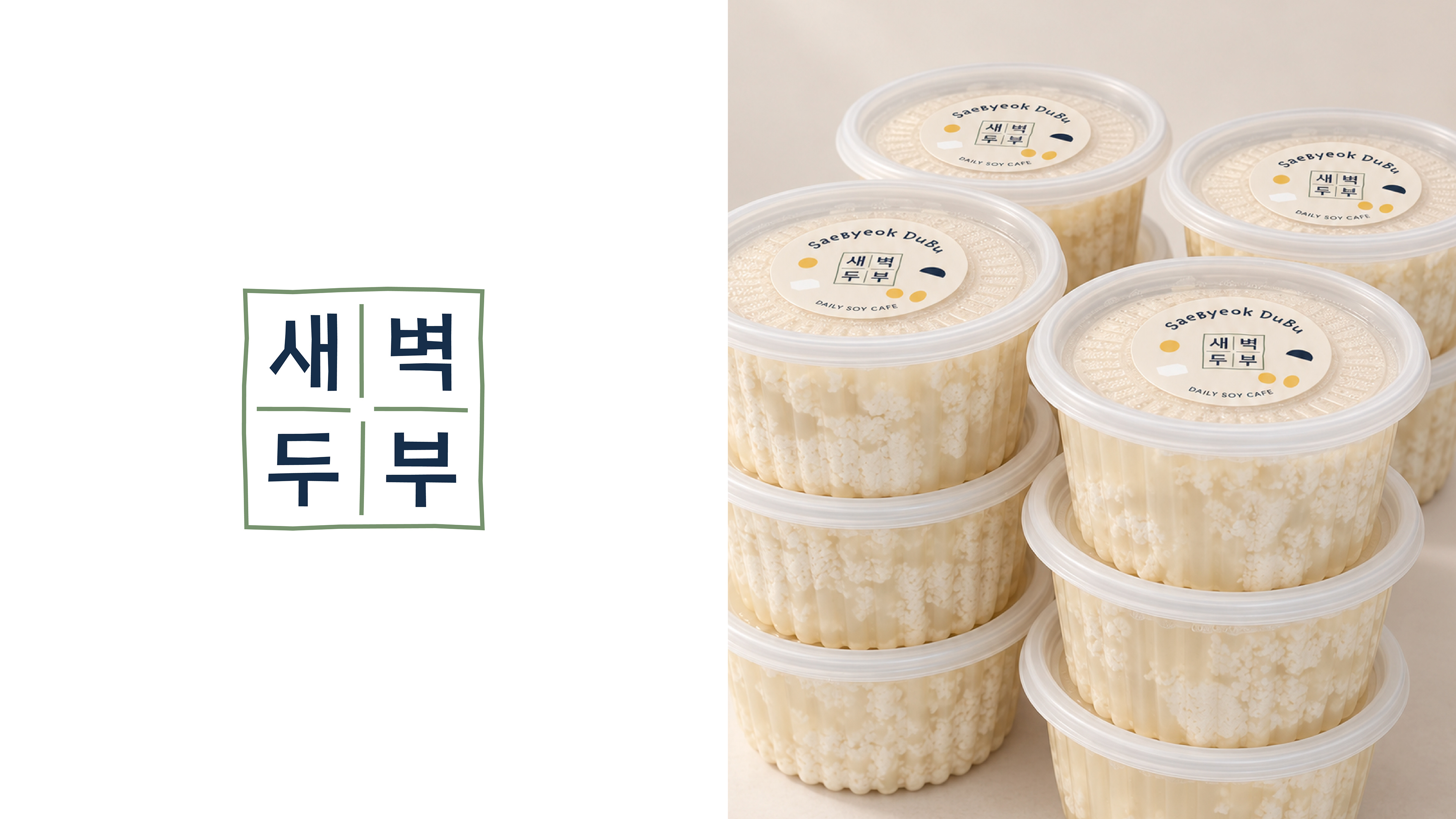
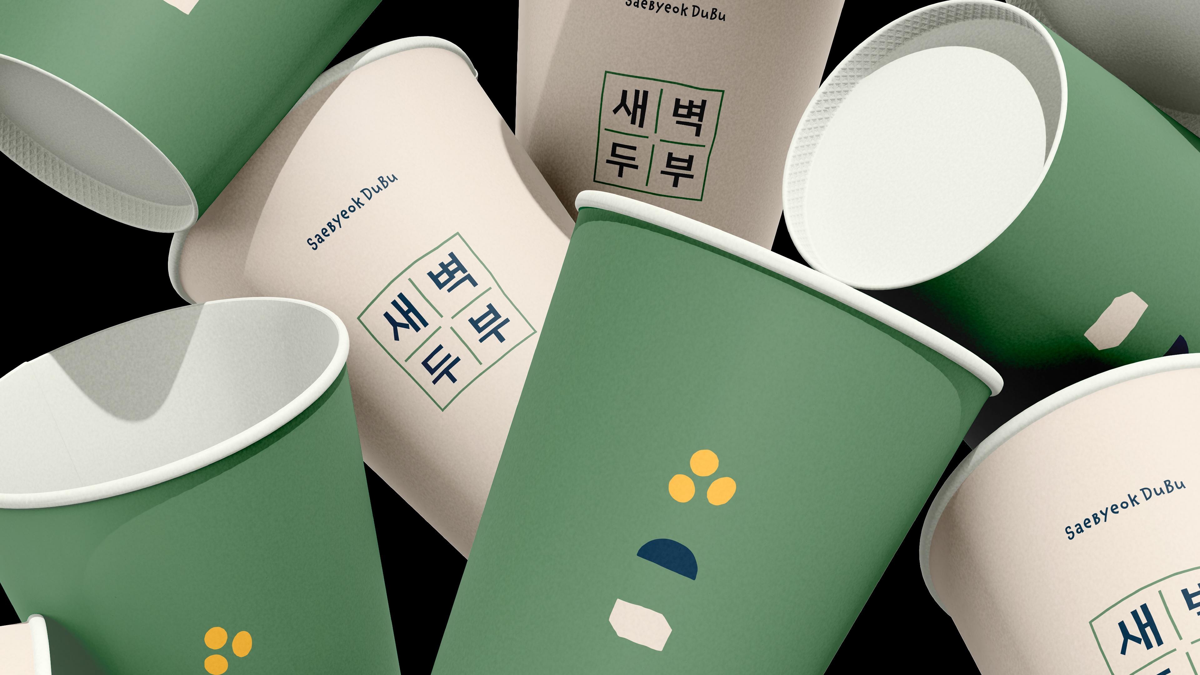
리디자인에서는 기존의 친근함과 수제 감성을 유지하면서 한글과 영문 로고의 조형을 현대적으로 통일했습니다. 또한 콩·새벽·두부·낮과 밤의 경계선을 단순화한 키비주얼을 개발해, 브랜드의 이름과 제품이 만들어지는 과정을 하나의 시각 언어로 연결했습니다.
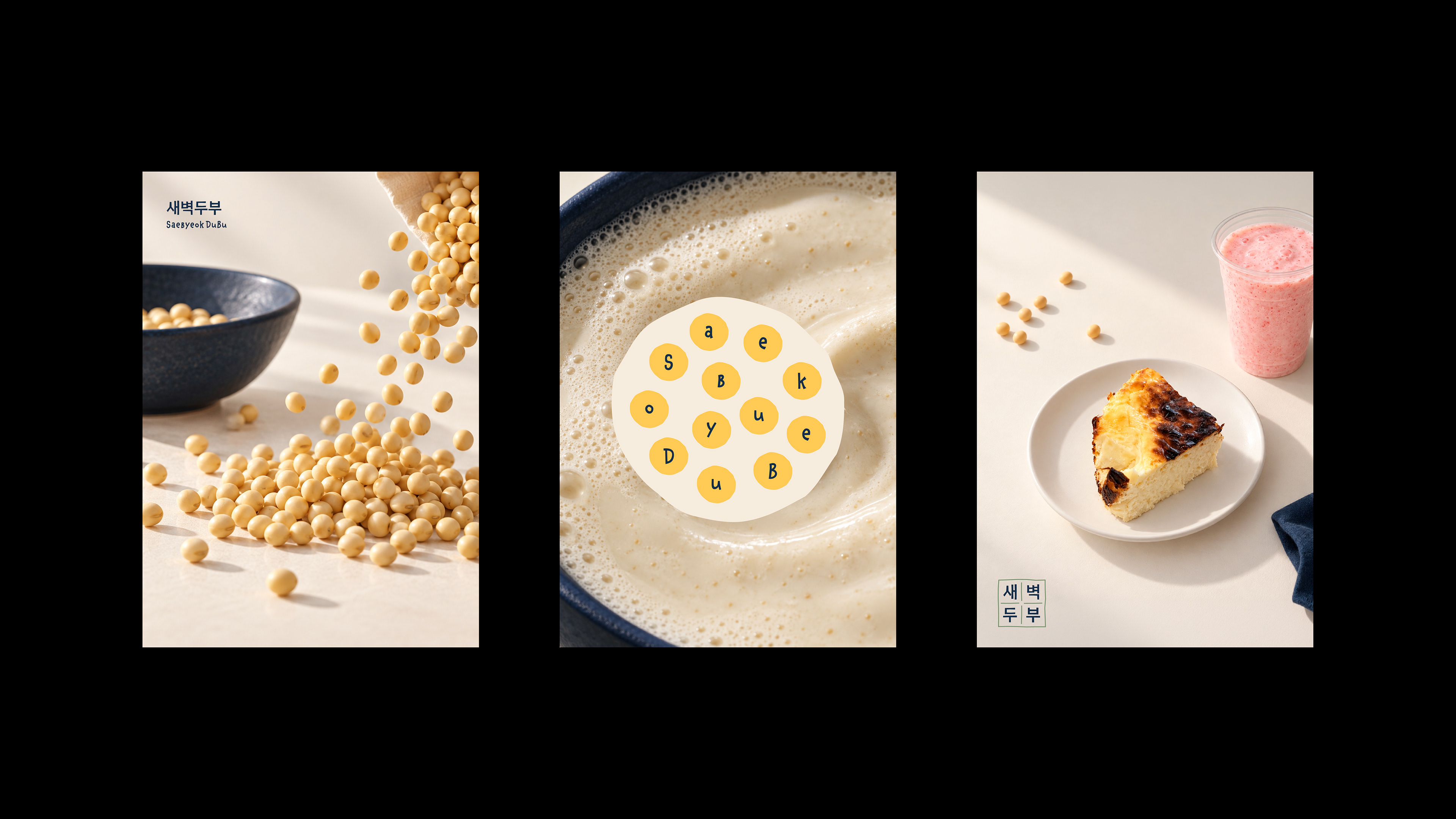
이를 통해 새벽두부를 전통적인 두부 전문점의 이미지에서 확장해, 매일 부담 없이 즐길 수 있는 트렌디한 데일리 소이 카페 브랜드로 새롭게 정의했습니다.
(A Highly Subjective) Saebyeok Dubu Rebranding Project
Saebyeok Dubu is a café I frequently order from, so this personal rebranding project began with genuine affection for the brand and a desire to explore its visual identity from a fresh perspective.
The original identity combined a typographic logo with a tofu character, but the two created different visual impressions and made it difficult to communicate a consistent brand image. Its strong focus on directly representing tofu also left limited room to express its broader identity as a café where customers can enjoy soy drinks and desserts.
The redesign retains the brand’s friendly, handmade character while giving the Korean and English logotypes a more contemporary and cohesive form. A new key visual system—simplifying soybeans, dawn, tofu, and the boundary between night and day—connects the brand name with the process of making its products through a unified visual language.
Through this redesign, Saebyeok Dubu is redefined beyond the image of a traditional tofu shop as a trendy daily soy café brand that can be enjoyed comfortably every day.