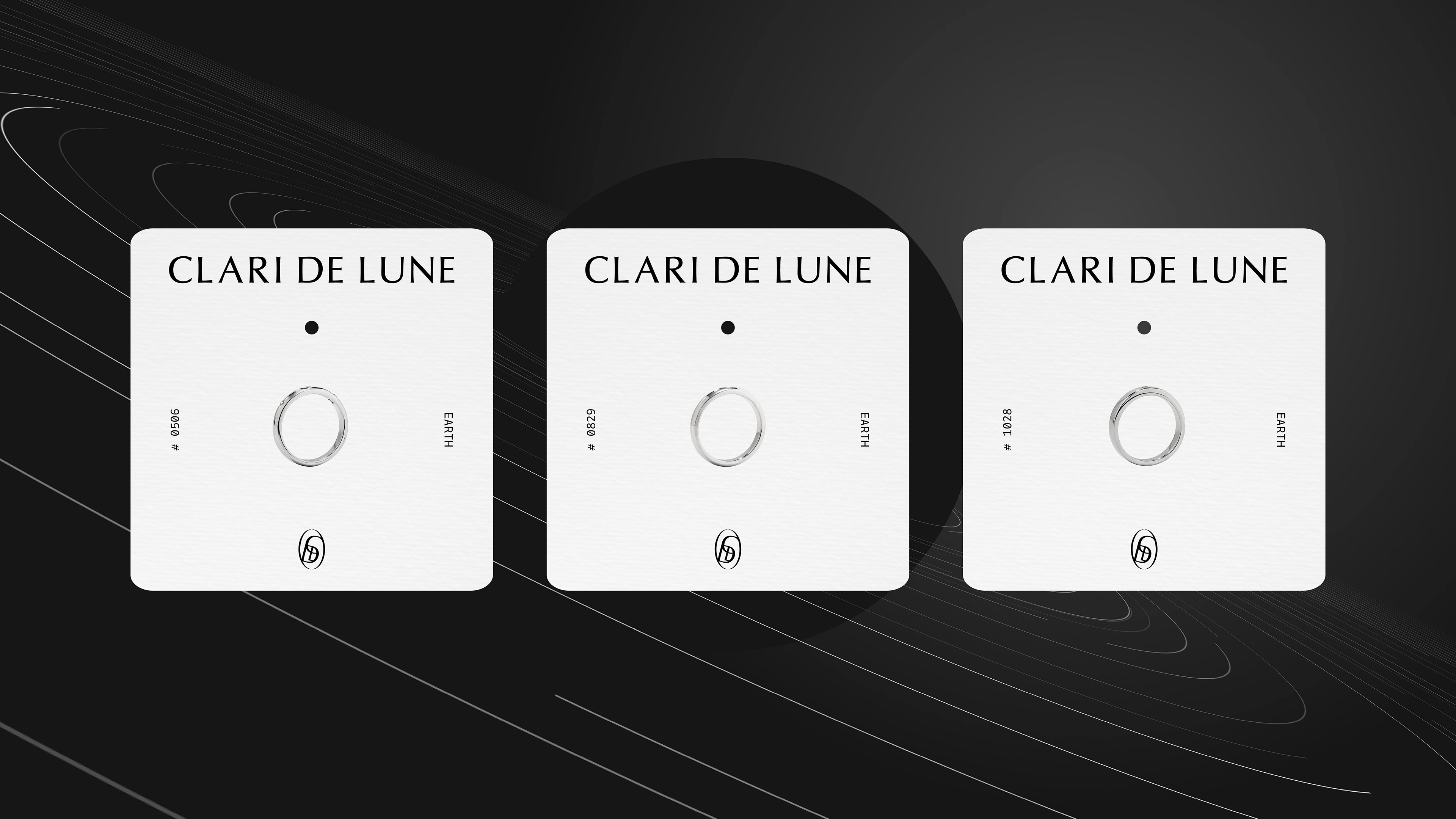
Clari de Lune — a daily silver jewelry brand that is quiet like moonlight, yet lingers in memory.
Inspired by the moon and celestial orbits, we visualized the subtle flow of light that the brand weaves into everyday life. The logotype utilizes a typeface sitting on the boundary between serif and sans-serif, expressing both classic elegance and modern restraint. The symbol integrates the letters C, D, and L into a single form set within an elliptical orbit, encapsulating the brand's name and worldview. Through a graphic system that flows flexibly along the orbit, we completed the brand message: ‘Subtle, yet Timeless.’